29 April, 2013

smool by Robert Bronwasser

Robert Bronwasser is a Dutch designer that began ‘smool design’ in 2002, a design agency with a personal approach and dominated by his vision of commercial product design. Bronwasser has since worked for both marketing-driven multinationals and smaller, design-oriented businesses. Bronwasser combines creativity, many years of experience and knowledge of production techniques to develop a wide range of successful products. Since 2011, his design studio has been located in Amsterdam, where he shares creative space with design studio Reggs. This creates a unique cross-pollination and focused collaboration in large-scale multidisciplinary design products.

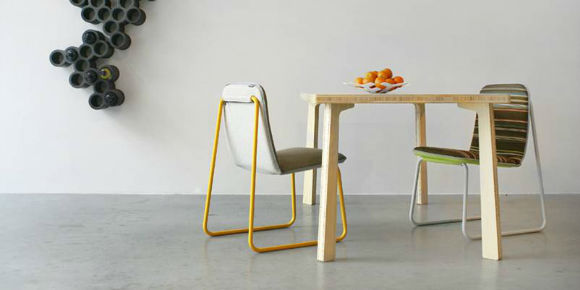
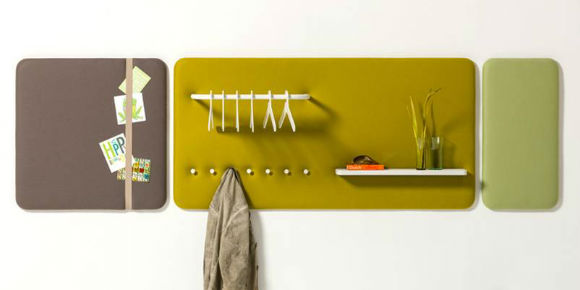
Industrial designer Robert Bronwasser makes ordinary products extraordinary, both in form and function.He creates products that are pleasant to use and that have their own unique character.Products that are recognisable, logical and distinctive. In 2012 Bronwasser is ambassador of the Dutch Design Week, the largest design event in the Netherlands.

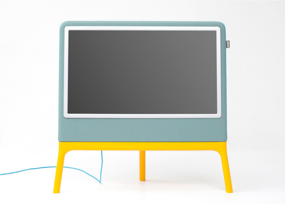
Bronwasser presented a television set wrapped in fabric at Ventura Lambrate in Milan earlier this month. The Homedia TV has a curved fabric back and stands on brightly coloured legs. "While the number of channels in the past 20 years has quadrupled, the industrial design of the TV exterior did not evolve," explains Bronwasser. "The average telly is a technical black shrine constructed of hard plastic. And the worst part is, its uninspiring form is dominating our interior." [1]

28 April, 2013

Staring at the sun

In the three years since it first provided images of the sun in the spring of 2010, NASA’s Solar Dynamics Observatory has had virtually unbroken coverage of the sun's rise toward solar maximum, the peak of solar activity in its regular 11-year cycle. This video shows those three years of the sun at a pace of two images per day. SDO’s Atmospheric Imaging Assembly captures a shot of the sun every 12 seconds in 10 different wavelengths. The images shown here are based on a wavelength of 171 angstroms, which is in the extreme ultraviolet range and shows solar material at around 600,000 kelvins (about 1.08 million F). In this wavelength it is easy to see the sun’s 25-day rotation as well as how solar activity has increased over three years.

During the course of the video, the sun subtly increases and decreases in apparent size. This is because the distance between the SDO spacecraft and the sun varies over time. The image is, however, remarkably consistent and stable despite the fact that SDO orbits Earth at 6,876 mph and Earth orbits the sun at 67,062 mph. Such stability is crucial for scientists, who use SDO to learn more about our closest star. These images have regularly caught solar flares and coronal mass ejections in the act, types of space weather that can send radiation and solar material toward Earth and interfere with satellites in space. SDO’s glimpses into the violent dance on the sun help scientists understand what causes these giant explosions -- with the hopes of some day improving our ability to predict this space weather.


the pantone portraits of Angélica Dass

Angélica Dass, according to her bio was born in 1979, in Rio de Janeiro, but now lives and works in Madrid, Spain. "Angélica raises his work as a tool of exploration, questioning and searching for identity, their own and others and understand the photography like a dialogue, like a game which the personal and social codes are put at stake to be reinvented, a continuous circulate and flow between the photographer and the photographed, a bridge between masks and identities." Humanae is a project (still work in progress) where portraits of people are matched to the Pantone that corresponds to the tone of their skin. The series is available here and in the more flowing Tumblr page here. The results is not always successful, however it is a refreshing idea, certainly a unique photography project, and quite a volume of work.

The project development is based on a series of portraits whose background is dyed with the exact Pantone tone extracted from a sample of 11x11 pixels of the portrayed´s face. The project’s objective is to record and catalog all possible human skin tones. "Humanæ it’s a pursuit for highlighting our subtle-continuous of our tones that make more equality than difference… our true colors, rather than the untrue Red and Yellow, Black and White. It is a kind of game for subverting our codes. The audience is free to read into it. The ultimate goal is to provoke and bring currently using internet as a discussion platform on ethnic identity, creating images that lead us to match us independent from factors such as nationality, origin, economic status, age or aesthetic standards."

the Sever bar in St.Petersburg

The philosophy behind the creation of Sever Bar in Saint Petersburg is, as you can see, non-invasive; while it’s not exactly a restoration project, neither is it a transformative one either. The painfully original features of the venue, mainly the brutal brick and concrete walls, date from the days when Saint Petersburg was still known as Leningrad, and this premises was the refrigeration room of the Smolninsky bakery.

Sever is a bar with a cool underground feel that has quickly gained huge popularity among the city’s artsy crowds. It measures just 86 sqm, and the space has been designed by Saveliy and Egor Arkhipenko, respectively the creative director and architect on the board of loft Proyekt Etazhi. The fraternal duo wisely decided to leave the industrial space intact, and only tweaked the design with a few minimal interventions. The concrete walls have been painted in a matte grey hue, while the eye-catching narrow corridor with a modern sturdy wooden bench and tables, reveals bare bricks and tiles covered in seemingly dripping black tar. And matching Sever’s cool vibe is a creative menu that not only includes the required cocktails, shots and homemade herbal liquors for the party squad, but also various teas served in traditional Russian thermos flasks that are more fitting for daytime socializing. [2]

Hummingbird : a new music notation system

Learning to play an instrument is hard, but sheet music makes it even harder. Anyone who has been taught music will asure you that music notation never comes easily. It can often take months (or longer) to pick up. The sheet music just isn’t intuitive. And that shouldn’t be the hard part, and just like when reading a book, you think about the meaning and not which letter is which. Hummingbird’s strength is in its reinforcement. Everything has both a symbol and a spatial element so you can read it and perceive it at the same time. Plus, it does all this without sacrificing the important things ; it can show anything that traditional notation can, and you can still write it out by hand. [1]

Pitch positions haven't changed, the notes are on staff lines in the same position as in traditional notation. Each pitch also has a unique symbol with its own mnemonic “helper” word that describes it. Pitch symbols are the same for all clefs and octaves. Sharps point up and end with a + sign; flats point down and end with a 0 sign. To avoid confusion, accidentals connect directly to the note and are visible every time they occur. When it helps, naturals can be used too, and they look like = signs. Each rhythm and rest has a unique symbol. The horizontal lines for quarter, half, and whole notes extend for distances that correspond to their durations. The precise lengths may differ to allow better formatting, but within each measure they maintain correct relative proportions. Read more in the offered guide here.


Hummingbird according to its creators is "a fresh take on music notation, that is easier to learn, faster to read, and simpler for even the trickiest music." Check out the video above and try it for yourselves.

25 April, 2013

the flowing forms of Molo Studio

Molo, based in Vancouver, Canada, is a collaborative design and production studio led by Stephanie Forsythe and Todd MacAllen. The molo studio is dedicated to the research of materials and the exploration of space making. As a design and manufacturing company, molo creates and distributes its unique and innovative products to clients around the world.

Dedicated to an exploration of sensory experience in space making, combined with experiments in manufacturing, materials and structure, the molo studio explores overlapping realms of art, architecture and design. molo has created projects as diverse as a museum in Japan, a modular wall system and a tea set. molo's products are inspired by studies in architecture and the idea that smaller tactile objects have a real potency in the physical experience of the built environment. Working back and forth between the intimate scale of furniture and small utilitarian objects, to the larger scale of buildings and landscapes heightens the sense of human scale and physical experience in architecture and brings the perspective of thinking in a larger context into the creation a smaller object.

softwall + softblock is a modular system. This means that walls and blocks of various heights, colours and materials all connect to each another, simply and seamlessly, with concealed magnets. It is possible to create continuous lengths of wall, stretching as far as your imagination... or stack blocks vertically like stretchy lego.

the secret life of superheroes by Greg Guillemin

It may seem like superheroes spend their entire day saving us regular folk from world threatening danger on a day to day basis, but believe it or not they actual lead real lives as well. Artist and illustrator Greg Guillemin exposes superheroes daily lives in a series aptly titled ‘The Secret Life Of Superheroes.’ The series features some of our favorite heroes from both the Marvel and DC universe, doing normal things just like me and you would. What kind of things you ask? Well Superman can be seen picking his nose, Spider-Man hooking up with Mary Jane, Batman brushing his teeth before getting fresh with Robin, and Wonder Woman stuffing her bra before saving the world. [1]

Superheroes are from Marvel and DC comics. View and purchase online here. Check out the whole series I and II here.

21 April, 2013

MO House : living spaces among pine trees

MO House testifies one of those cases when the rule becomes the exception. In Madrid, Spain a single family house spreads all its energy through a dense green forest. An exquisite desire has lead to an astonishing volumetric result. All trees had to be preserved in their original position. Although the conventional domestic program, the site’s morphology demanded a compound geometry for the positioning of the house. The prevailing presence of trees and the deep wish to achieve an inhabitable space fully integrated with the woods resulted in a unique solution.

Spanish architectural firm FRPO, have devised a program that resulted in a very direct way to a number of simple rectangular volumes, each one with its own function. The multiple topological relations between these volumes determined a series of useful solutions, 24 in total. The configuration of the MO House was determined by relating voids with volumes and existing trees. Five bedrooms, one study room, kitchen, living and dining rooms are organically distributed between the trees; all connected by interstitial spaces – corridors – that often turn into an extension of one of the major volumes. However, a curious design decision turns MO House into an example of prefabrication and self-sustainable architecture: wood as the main constructive material contribute for an even more integrated solution. The proximity of trees required a non-aggressive foundation system, so galvanized steel micro piles were used with only 2 meters long.

Confederate X132 Hellcat

Named after the legendary F6F Hellcat fighter plane of WWII, the X132 Hellcat is the result of an uncompromised design and manufacturing approach. Drawing on the first and second generation Hellcats' distinctive drag race architecture, the third generation Confederate X132 Hellcat advances that architecture with innovative engineering and avant-garde design.

The centerpiece of this uncompromised approach is the Hellcat's billet aluminum case. Instead of the usual casting method, the Hellcat's case is machined from two blocks of billet 6061 aircraft grade aluminum.  This new case unites the best V-Twin technology and superior powertrain technology into a singularity.  Although this material selection and craft methodology is expensive, it is simply the best approach for maximizing strength and guaranteeing permanence. Simply put, the X132 Hellcat is America's most substantive road bike. More details, pictures and purchasing info available here.

vintage edition Scrabble

Scrabble may be a household name in 2013, but the popular board game had humble beginnings when architect Alfred M. Butts lost his job during the Great Depression in the 1930s, and decided to create it. At that time however, it was not known as Scrabble. In fact it wasn’t until Butts teamed up with James Brunot in 1948 until the game went from called things like Lexico and Criss Cross Words to the more simple, easy to remember Scrabble.

The game has of course gone to become a fan favorite over the decades, and to celebrate over 100 million games being sold Restoration Hardware has introduced this beautifully crafted Vintage Edition Scrabble. The board game has been completely re-imagined as it may have been in its early days. Game cabinet is crafted of solid hardwood and features die cast metal accents, including the drawer pull and tile racks. You can find it here.

how to swear around the world

There are several must have items for your modern day jet setter, and now we can add a new one to the list in this How To Swear Around The World. Written by Jason Sacher and illustrated by Toby Triumph, this is an essential phrasebook that will show you how to tell people off in the most effective way in every part of the globe, and even includes illustrations making it easy even for the slowest of learners. Now, with over 6000 different languages spoken all over the globe, this is by no means a comprehensive catalogue of all the various profanities, but it will surely allow you to offend other people, by swearing or profane oaths, from one corner of the world to the other.

The book description from Amazon goes like this : "This essential phrasebook collects the most colorful, explicit, and outrageous ways to tell people off in every part of the world. Featuring dozens of different languages, the sayings range from everyday swears to family curses to expressions for X-rated relations with animals. Phonetic pronunciation is provided so that readers can curse like a native, and handy illustrations provide visual guides to these foreign exclamations. Perfect for the international traveler who may need to wish an enemy a painful death, insult a person's grandmother, or accuse someone's mother of having intimate relations with bears in the forest."

18 April, 2013

Market Lane Coffee

Market Lane is a specialty coffee roastery, cafe, and retailer, born and based in Melbourne. In their own words : "At Market Lane, we are not great multi-taskers. We focus on only one thing: delicious high-quality coffee. Admittedly, we are a little obsessed. We spend our time sourcing beans from some of the best coffee growers in the world, looking for superior coffees that are distinctive and memorable and can stand up on their own without blending. We roast them carefully to bring out the most exquisite characteristics in the cup. We then lovingly brew coffee for our customers, and help you find the right tools to brew to perfection at home. We only serve coffee that is in season, and we love to share the stories of where our beans come from, and how their journeys have influenced their taste."

In a very interesting spin, apart from the roasts and blends that they offer in coffees and teas, and the assorted merchandise for producing great quality coffee at home, they also offer classes and tutoring in becoming a brewer yourself. Start by introductory classes in tabletop brewing methods, and proceed to roasting techniques etc. Their brewing guides are also offered on video. Watch them all here. Market Lane coffee, operate a couple of locations. See a comprehensive review with photos here. The images included here a re from both locations.

U Barba in Milano

U Barba (named after a local comedian from the 1930s) is located in the lively Porta Romana district of Milan. The owners, Marco and Paul, wanted to create a laid-back place to hang out with family and friends, where they could offer the distinct Genovesian cusine (since they are both from Genova). They refurbished an industrial space with vintage finds and reclaimed wood, created an outdoor dining terrace, and added a bocce court for post-dinner games. A really handy visual presentation of the menu (with the actual dishes served) can be viewed here.

The ambience and the atmosphere is worth checking out, although some may not be excited with the dishes served. The simple menu features classic, herbaceous Genoese fare, including trofie, an egg-less pasta, served with pesto and potatoes. The design however of the whole place is very good and gives out a warm homely feeling. When the days (and nights) are good, the garden area on the back is a definite attractor. Chill out under the canopy with a beer, or chat to your neighbours around the large communal table or play a game or two of bocce. You’ll have a ball. Read some reviews here.

welcome dear reader.

blank

What you are browsing through is the initial form of a gazette, realised at this stage by a collection of posts brought together, from various fields & selected topics, aiming towards your entertainment and information. Some are own generated, others are processed re-ups from the blogosphere. Please feel free to browse, read, and distribute the content here.

blank

If you find what you read here as interesting, entertaining or thought-provocative, please tell it to your friends. New readers are always welcome. If you have copyright claims, please let us know, and we will amend accordingly.

blank

Images presented herein, are the property of their originators, unless stated otherwise. The METRONOME gazette wishes to declare that to the best of its knowledge, all photos and information presented in this website are true and valid, however it carries no responsibility as to the accuracy of the depictions, or wording of the posts, that are not of its own origination.

blank

Please do not hesitate to contact us with any inquiry or question you may have. See the Contact details section.
  

blank

about

blank

contact

blank

editorial

blank

theNEWSroom

blank

theMAGAZINErack

blank

DIY projects

blank

GAMESZONE

blank

GoingOUT

blank

Food4Thought

blank

PROJECTS

blank

blank

blank